FutureMe

Redefining Career Guidance for
Ashesi University Students
Table of Contents
Scope of the project
Research & Findings
Design Process
Iteration Based on Feedback
Final Design and Implementation
Outcome & Learning

A short walkthrough of the final system before diving into the process:


Scope of the project

Role
Lead UX Designer
Duration
May 2022 to August 2022
Team
Four members
Skills
  • Project Management
  • Leading a Design Team
  • Usability Testing
Summary
As Lead UX Designer, I designed FutureMe, a web-based career guidance platform for Ashesi University. The tool connects academic courses to potential career paths through personalized recommendations, helping students make informed and confident decisions about their futures
Problem Statement
Liberal arts students often struggle to choose careers due to unclear guidance and too many options. Advisors sometimes provide biased or incomplete advice, and students have difficulty linking courses to potential career paths because the information is hard to find.
Project Background
Ashesi University's Career Center recognized the need for a solution that could help students make informed career decisions by connecting academic courses to potential career paths. This project was carried out from May 2022 to August 2022.

Research & Findings

User Research
To understand the challenges students faced in making career decisions, we began with a kickoff meeting with Ashesi’s Career Center to clarify the platform’s goals and values. I conducted 15 user interviews with students, career advisors, and faculty members, and a survey with 100 students to gather both quantitative and qualitative insights.
Key Findings
Students felt overwhelmed by the amount of available information.
Many were unsure how their completed courses aligned with potential careers.
Career guidance was inconsistent and often biased.
Most lacked clarity and confidence in their career choices.
User Groups
Students
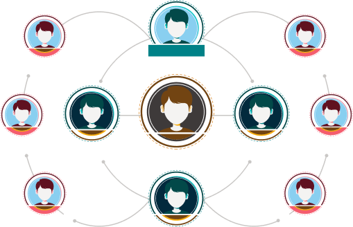
Individuals looking to find the best career path based on their completed courses or determine the necessary courses for a chosen career.
Career Center Staff
Providing guidance and needing a reliable tool to streamline advising
User Interviews & Surveys
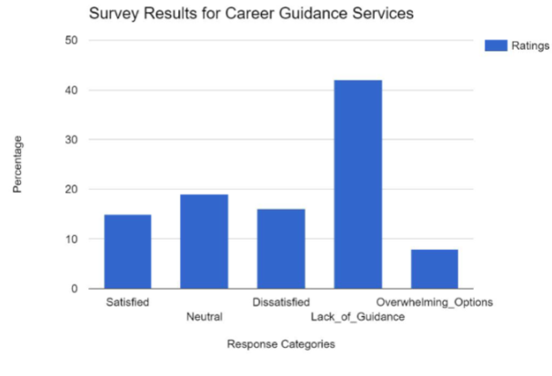
As shown in the chart, over 40% of respondents reported feeling overwhelmed by the number of career options, and many cited dissatisfaction or lack of clear guidance. These findings confirmed patterns seen in our interviews, where students described unclear connections between their coursework and potential career paths.

This research directly informed design decisions focused on simplifying the experience, improving guidance clarity, and personalizing recommendations.

Design Process

User flows and Sitemaps
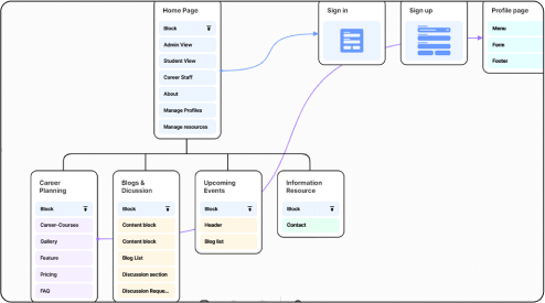
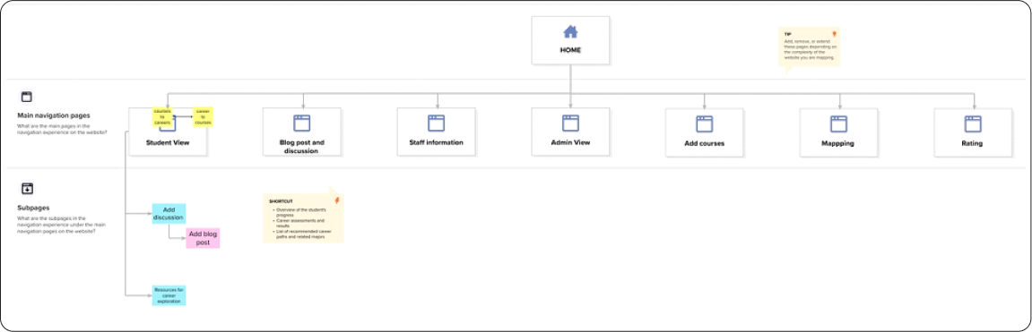
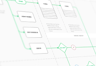
We established user flows for both students and administrators to ensure that the system met their specific needs. The sitemap was created to facilitate intuitive navigation, allowing users to easily find relevant information.

The Sitemap

Wireframes
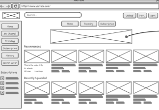
Using Figma, I created low-fidelity wireframes to map out the structure and navigation of the platform.

These were reviewed with career center staff and student reps, leading to multiple iterations that improved clarity and usability.

This collaborative process ensured the final design was user-friendly and aligned with the project's objectives.
Navigation Design
I opted for a sidebar navigation to allow students to easily switch between different sections of the site without losing context. This decision was made over a top navigation bar because the sidebar allows for more detailed categorization and quicker access to frequently used features.

I initially considered a hamburger menu but found that it required more clicks and hindered accessibility.
Content Organization
I decided to group career information by industry and related courses to make it easier for students to explore different paths.

This was chosen over a linear list format to reduce cognitive load and improve discoverability. A card-based layout was tested but discarded after users reported difficulty scanning and comparing multiple options side-by-side.
Prototyping
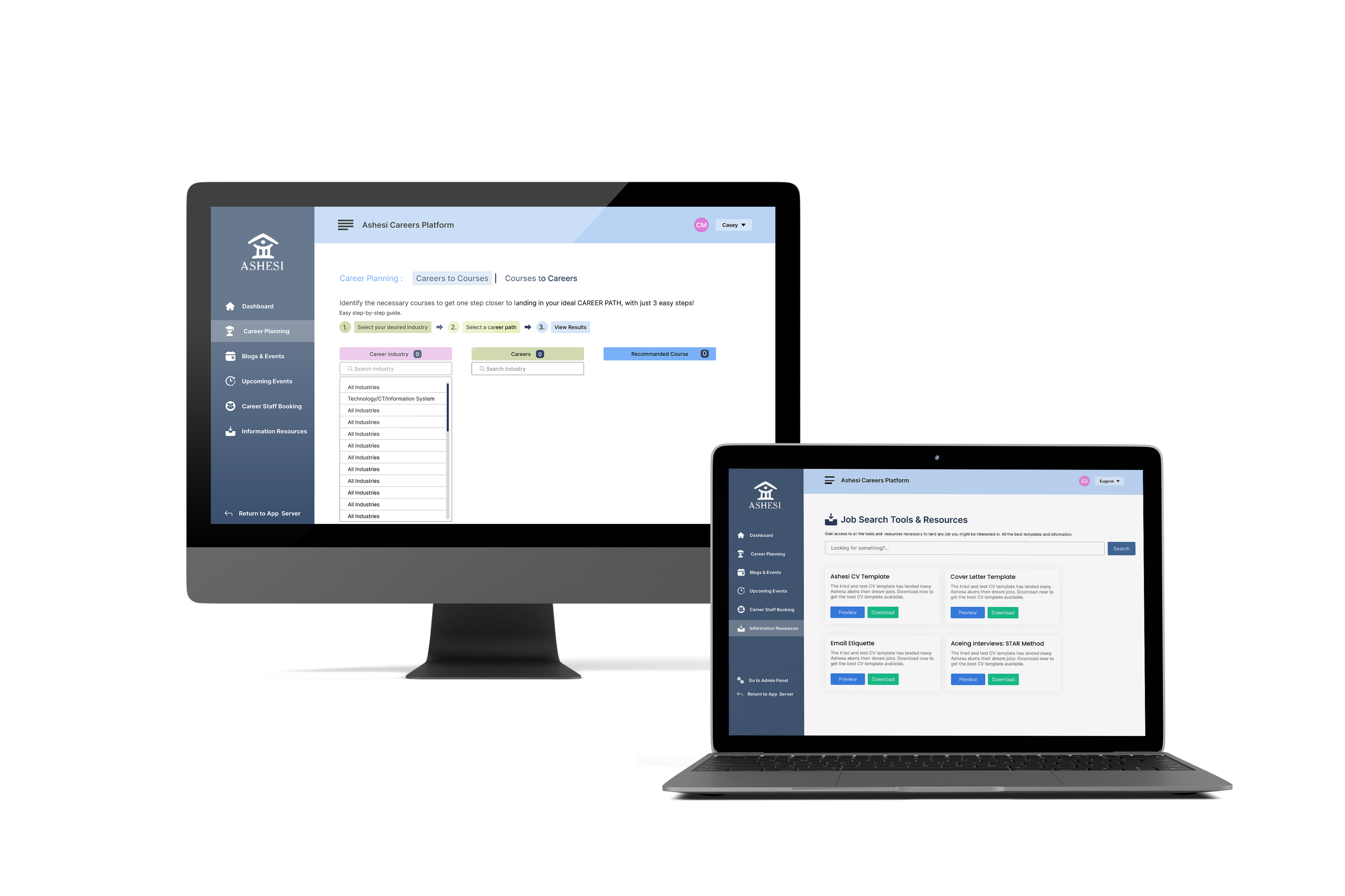
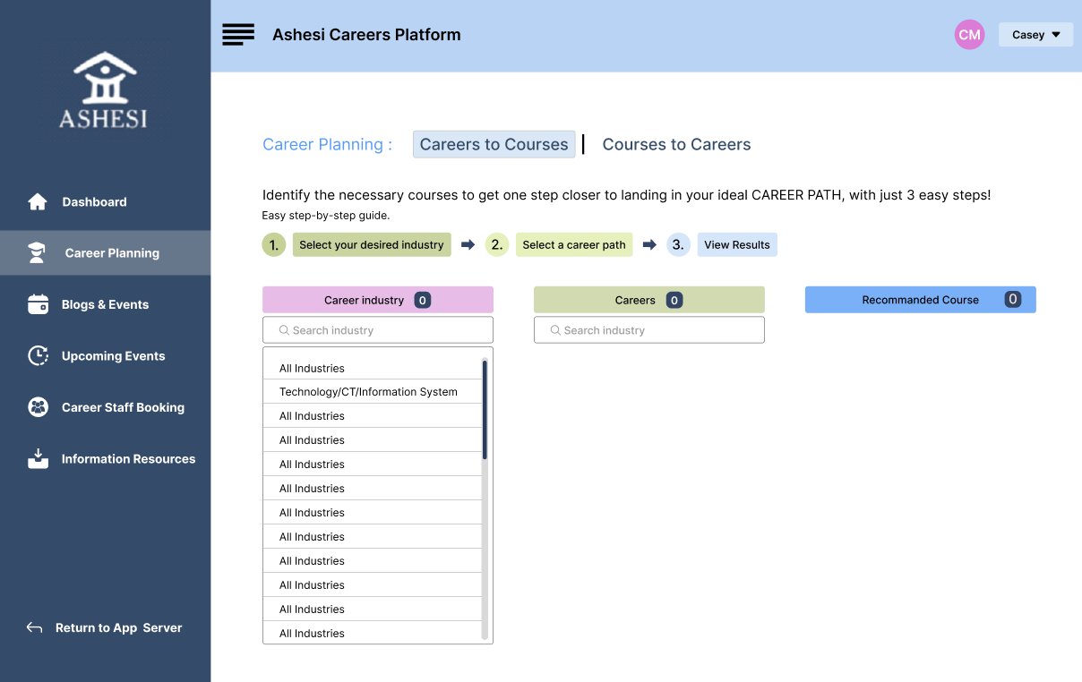
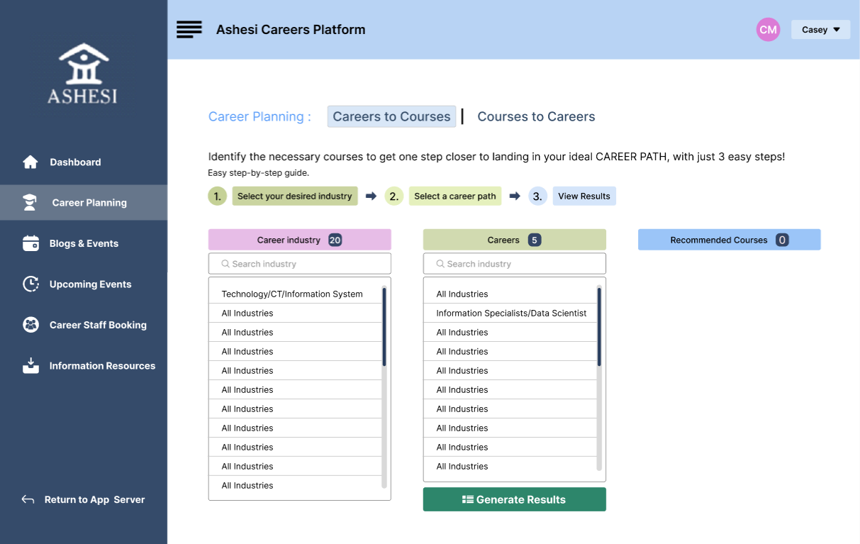
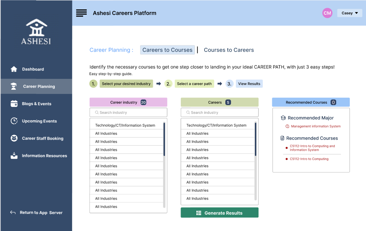
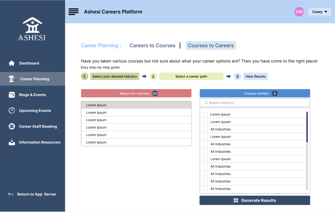
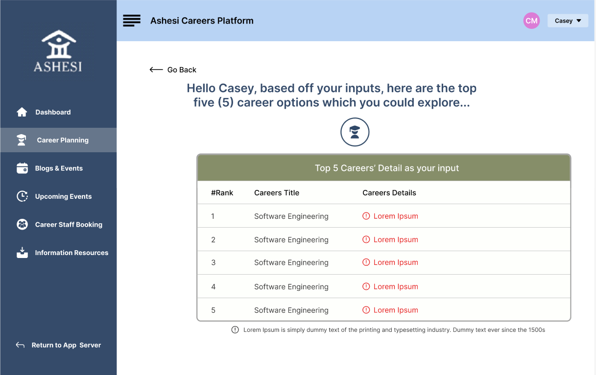
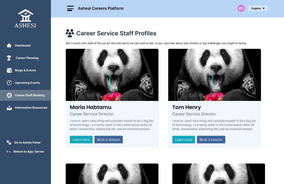
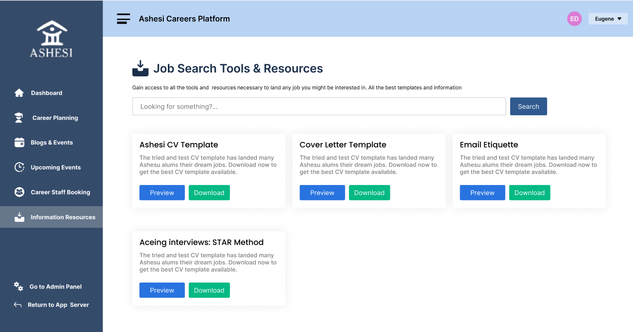
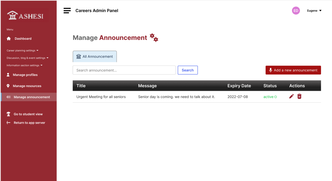
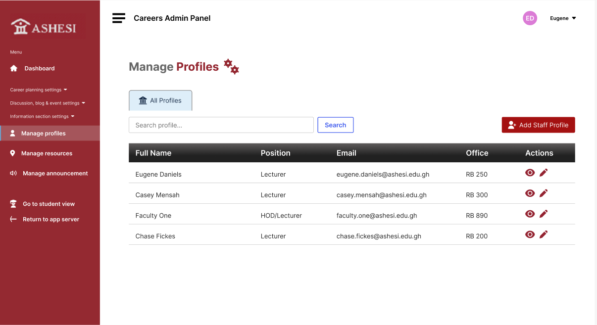
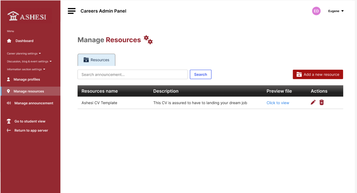
These polished UI screens showcase the final visual direction and structure of FutureMe. Each view is designed to support specific user goals — from exploring careers and planning academic paths to managing advisor profiles.

The tabbed screens below highlight key flows for students and administrators, including course-to-career mapping, session booking, and admin-only tools for editing bios and managing mappings.
During the usability testing phase, we encountered some critical issues that required significant changes to enhance the user experience:

Iteration Based on Feedback

Feature Visibility
Issue
Users struggled to find the search bar and key features like career path suggestions.
Solution
We relocated the search bar to the top of the dashboard and used a contrasting color to make it stand out. Quick links to popular career paths were also added to the homepage for faster access.
Button Placement
Issue
Buttons like "Learn More" and "Book a Session" were too close together, causing misclicks.
Solution
We added more spacing between the buttons and used distinct styling to reduce errors and improve task clarity.
Profile Information
Issue
Career advisor bios were too long, making it difficult to scan for relevant information.
Solution
We focused profiles on core info: expertise, availability, and contact. A "Read More" option was added to view full bios, improving clarity and reducing cognitive load.
Navigation and Information Architecture
Issue
Cluttered menus and poor hierarchy made it hard to navigate the platform.
Solution
We simplified the navigation by grouping related features and reorganized content based on results from card sorting sessions with users.

Final Design and Implementation

Prototyping
High-fidelity prototypes were created to reflect the detailed design of the FutureMe system.
Usability Testing
I conducted usability tests via Zoom with ten student assistants and five career center staff members. Feedback was positive, with key suggestions for improving the visibility of certain features and enhancing the search functionality.

Outcome & Learning

Conclusion
The launch of FutureMe led to a 25% increase in student engagement with career services and a 20% improvement in staff efficiency.By mapping academic courses to career paths through an intuitive interface and smart recommendations, the platform helped students make more confident, informed career decisions.
Learnings
  • ➤ User feedback drives clarity: Iterative feedback loops were essential in shaping a solution that truly met student and staff needs.

    Design must support decision-making: Simplifying complex information helped reduce overwhelm and boost engagement.

    Accessibility matters: Prioritizing accessible layouts and interactions made the platform easier to use for everyone.
View Other Work