Redesigning Site Builder

Princeton University's CMS Documentation Website
Table of Contents
Scope of the project
Research & Findings
Design Process
Iteration Based on Feedback
Outcome & Learning

Scope of the project

Role
Web Development,
UX, and Marketing &
Communication Intern
Duration
June 5, 2023 – August 11, 2023
Team
Sole UX intern, collaborated with supervisor
Skills
  • UX Design
  • Project Management
  • Research and Analysis
  • Web Development
CMS Redesign
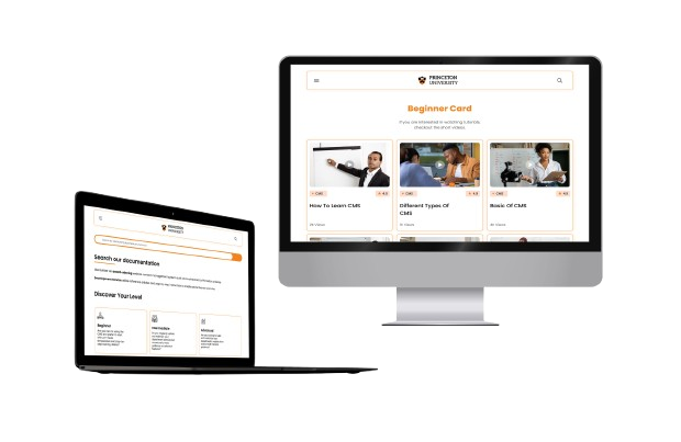
As a marketing and communications intern at Princeton University, I worked with both the Web Development and Marketing teams to redesign the university’s CMS documentation site. My goal was to improve content clarity, navigation, and accessibility for users ranging from non-technical staff to experienced developers.
Problem Statement
The CMS documentation website was cluttered and disorganized, making it hard for beginners, intermediates, and advanced users to find relevant content. This lack of clear structure and intuitive navigation led to user frustration and increased support tickets, highlighting the need for a comprehensive redesign.
Project Impact & Roles
This project led to a 16% increase in page views and a 20% decrease in user support tickets. My responsibilities included implementing user-centric content classification, conducting usability testing, producing training videos, and supporting the development of responsive
academic year websites.

Project Goals

Enhance User Experience
and Accessibility
Increase Engagement and Reduce Support Tickets
Improve CMS Efficiency
Conduct Usability Testing
Support Responsive
Design
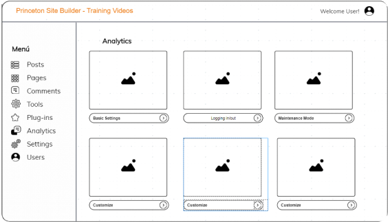
Create Training
Materials

Research & Findings

To begin the project, I conducted extensive research to understand the existing issues and user needs. This involved:
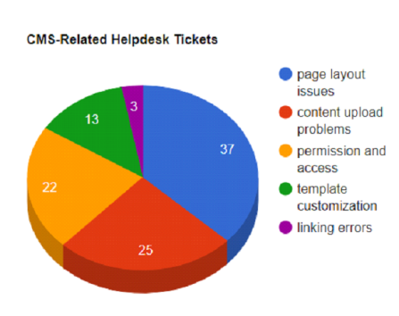
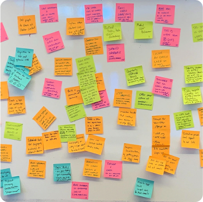
Analyzing IT Helpdesk Tickets
Reviewed helpdesk tickets regarding Site Builder to identify common user pain points.
Conducting internal interviews
Engaged with my supervisor’s team and other IT departments to gather insights.
Surveys
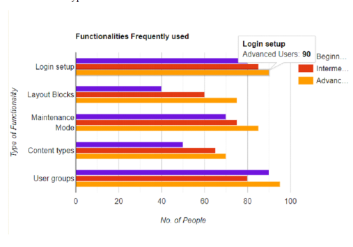
Distributed surveys to various departments in and out of IT to identify user groups, their engagement patterns with the website, and preferred content types.
User Group Identification
Recognized three primary user groups across the campus:
Beginners: Preferred using existing starter kits and required training videos.
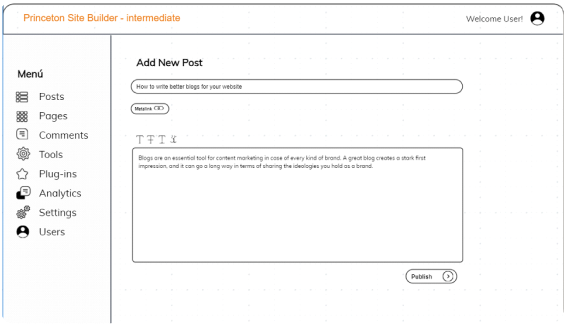
Intermediate Users: Regularly updated their websites.
Advanced Users: Desired to build websites from scratch.

Design Process

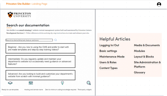
From the research and analysis phase, it became clear that users needed to quickly identify their user group upon landing on the CMS documentation website. This recognition was crucial for streamlining their navigation experience and ensuring they could easily access relevant content

Landing Page Design

Objective
Enable users to immediately determine which user group they belong to—Beginners, Intermediate Users, or Advanced Users.
Initial Concept:
Design Decision
Create a clean, intuitive landing page segmented into three distinct sections. Each section was clearly labeled and included a brief description of the user group.
Rationale
This approach aimed to reduce user confusion and ensure that each user group could quickly find the resources tailored to their needs.
Brainstorming Designs
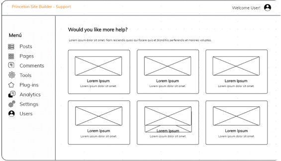
Mid-Fidelity Wireframes
Sketched initial wireframes to outline the basic structure and layout of the landing page.
High-Fidelity Prototype
Developed high-fidelity prototypes using Figma, incorporating detailed visual elements and interactive components.
Visual Elements
Icons and Colors
Each user group was represented by a unique icon to enhance visual differentiation.
Interactive Elements
Added hover effects to each section to provide additional information and engage users.
Navigation and Content Placement
Design Decision
Implemented a hierarchical content structure within each section. This included direct links to key resources, guides, and training materials.
Rationale
Simplified navigation and made it easier for users to find relevant content without unnecessary clicks.

Iteration Based on Feedback

To validate the effectiveness of the landing page design, we conducted usability testing with participants from each user group.
Testing Methodology
Participants
Selected 12 users, with four from each user group (Beginners, Intermediate, Advanced).
Tasks
Users were asked to identify their user group upon landing on the page and navigate to relevant content.
First Round Findings
Failure
Beginners, in particular, were confused about whether they belonged in the "Beginner" or "Intermediate" group.
Solution
Revised the descriptions to include more specific examples of tasks each group would perform and added illustrative images.
Second Round Findings
Failure
Users from all groups had difficulty navigating the deeply nested structure, making it hard to locate content quickly.
Solution
Simplified the navigation by reducing the number of nested layers, adding breadcrumb trails for easier backtracking, and introducing collapsible sections to streamline longer content areas. These refinements resulted in a more intuitive, scannable navigation experience across the site.
After multiple iterations and usability testing:  

Outcome & Learning

Success Rate
In the final round of testing, the majority of users were able to correctly identify their user group and navigate to relevant content without issues.
User Feedback
Feedback indicated that the new design significantly improved their ability to find necessary resources quickly.
Learnings
The iterative design process highlighted the importance of clear communication and simplicity in navigation. We learned that detailed user descriptions and visual aids are critical for user comprehension. Additionally, the importance of a streamlined, less hierarchical navigation structure became evident in reducing user frustration.
View Other Work