Technology@
Wooster

The technology documentation For
The College Of Wooster.
Table of Contents
Scope of the project
Research & Findings
Design Process
Iteration Based on Feedback
Final Design and Implementation
Outcome & Learning
A quick preview:


Research & Findings

User Research
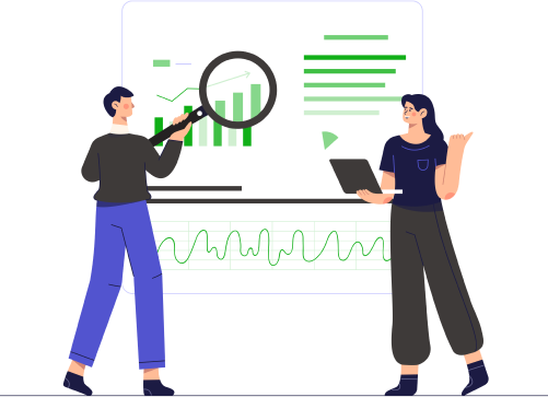
We began by conducting a comprehensive content audit, in which I and other student assistants meticulously reviewed all website content and categorized it based on relevance. We identified areas that required improvement and made note of them. Secondly, we also conducted usability testing with 20 participants.
Additionally, I analyzed website data to gain insight into visitor behavior and pinpoint specific pain points for users.
67% reported slow search results
88% found the navigation confusing.
50% highlighted the lack of mobile responsiveness.
Research Findings
Due to the website looking cluttered users would not spend time scrolling and would leave the website.
Different instructions on the website needed to be improved by providing a step by step process along with visual representation.
We calculated the 'Click-Through rate' and it revealed that the users are not clicking on the links and engaging with the website.

Scope of the project

Role
One of two UI/UX Designer
Duration
December 2022 – March 2023
Team
Two members
Skills
  • UI/UX Design
  • Research and Analysis
  • Website Data Analysis
Summary
As a Student Technical Assistant (STA) in the IT department, I worked with another STA to redesign the College of Wooster’s technology documentation site—the central resource hub for students, staff, and faculty using campus tools like printers, classroom tech, and online systems.”
Problem Statement
We received frequent support calls about basic issues that the website should have answered—due to poor navigation, an ineffective search tool, and unclear documentation. These frustrations affected both users and IT staff, showing the urgent need for a redesign.

Design Process

Brainstorming
We established user flows for both students and administrators to ensure that the system met their specific needs. The sitemap was created to facilitate intuitive navigation, allowing users to easily find relevant information.
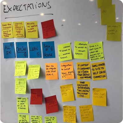
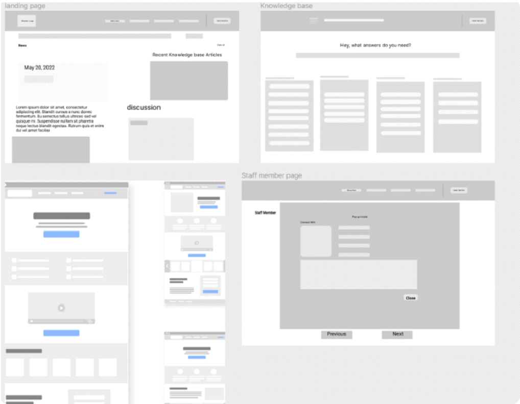
After laying out the needs and expectations, we went straight ahead with making wireframes:

Iteration Based on Feedback

We developed three prototypes and conducted usability tests with a focus group of 20 users. The first two prototypes failed to meet user expectations, but each iteration provided valuable insights that guided our improvements.
Prototype 1: Baseline Validation
Design Decisions
Alphabetical Layout: Maintained the existing alphabetical layout to assess basic functionality improvements.
Basic Search Optimization: Attempted to improve search speed with minimal backend changes.

Issues
Users struggled with the alphabetical navigation (50% failure rate) due to its lack of context and relevance.
Search results were still slow (average response time: 17 seconds).
Prototype 2: Thematic Restructure
Design Decisions
Organized by Digital Chapters: Content was reorganized into digital chapters, grouping related information together to improve relevance and ease of access.
Sidebar Navigation: Implemented a sidebar navigation to facilitate easier browsing through chapters.
Initial Mobile Optimization: Began addressing mobile responsiveness with basic adjustments.
Issues
While improvements in navigation were noted, mobile responsiveness was poor (34% dissatisfaction). Users requested a predictive search feature for quicker access to relevant results.
Prototype 3: Predictive + Mobile-First Redesign
Design Decisions
To address poor mobile responsiveness and the demand for a predictive search, we decided to prioritize these features. The decision to implement predictive search over further navigation changes was based on feedback indicating that quick access to search results would significantly improve user experience.
Breakthrough
Features Implemented:

Predictive Search Feature: Enhanced search functionality to provide instant and relevant results.
Full Mobile Optimization: Ensured the site was fully responsive and user-friendly on mobile devices.
Refined Digital Chapters: Improved the organization within digital chapters, making it even easier for users to find related content and links.
Step-by-Step Guides with Images: Replaced large chunks of information with step-by-step guides accompanied by images to enhance user understanding and engagement.

Final iteration :  


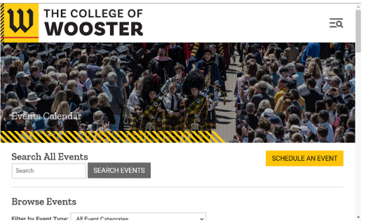
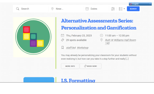
Comparison of the before
and after: 

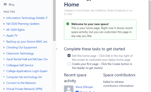
Before
After
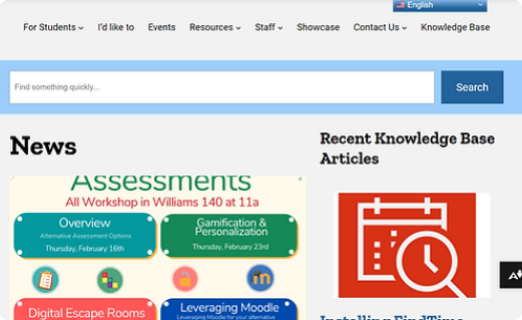
Before
After
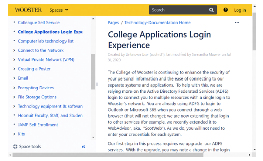
Before
After
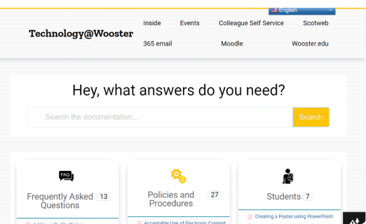
Before
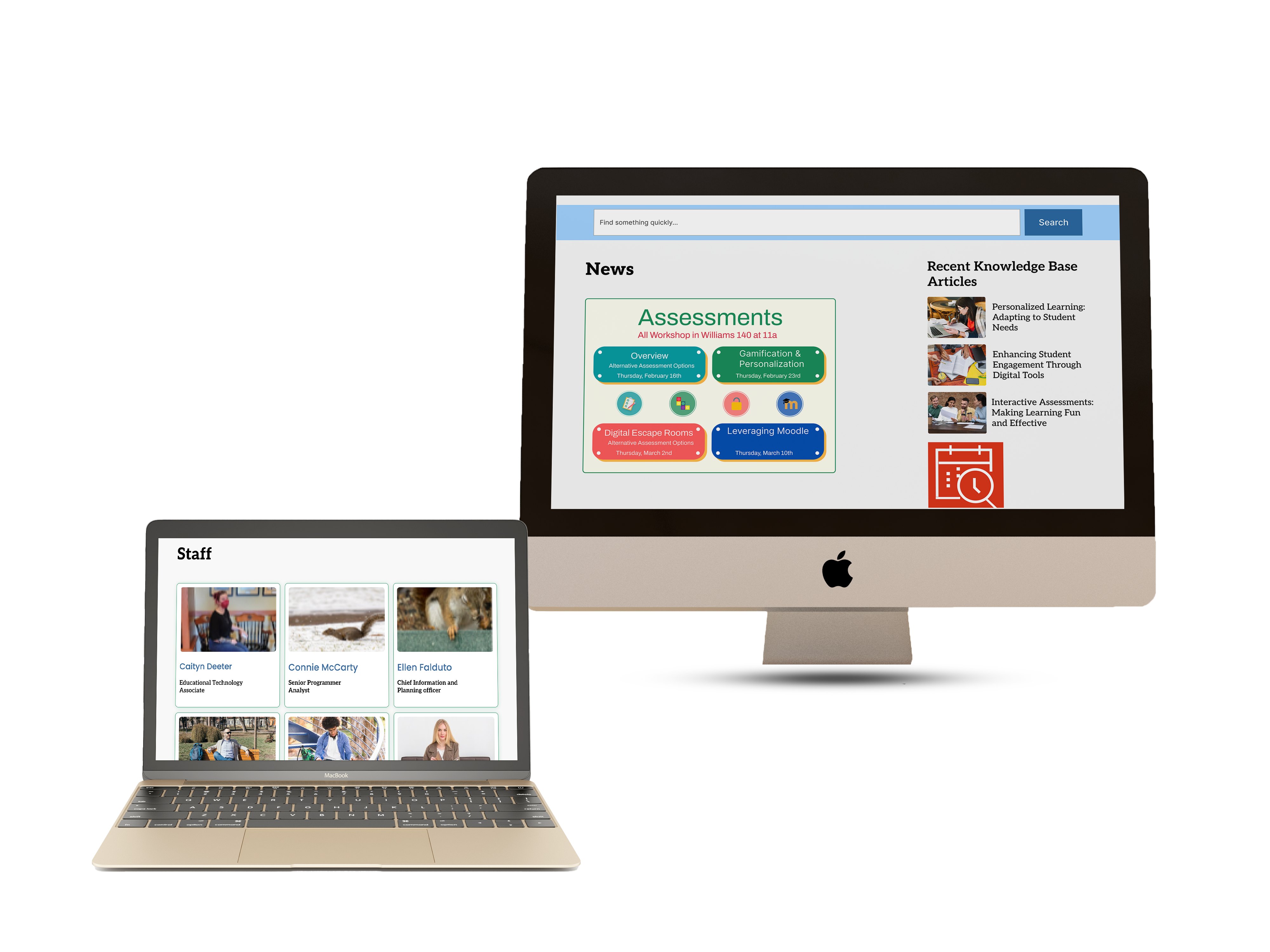
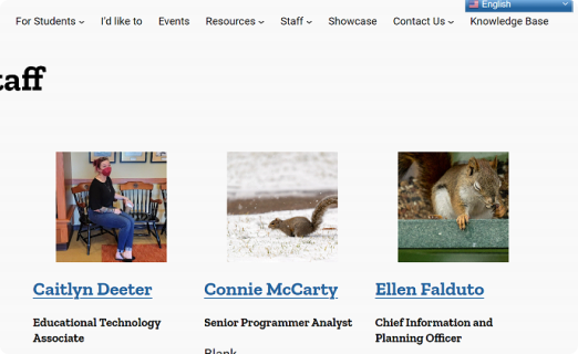
I added a staff profiles section to the college's technology documentation website to provide valuable information about the expertise and experience of the technology staff.
This enhances the user experience and builds trust with users, especially for those who require technical support or guidance.
After

Outcome & Learning

Results: What Changed After Launch

Within two months of launch, we observed measurable improvements in user behavior and internal support load.
+80% Navigation Success Rate.
Predictive Search: 2s Avg.
76% Mobile Satisfaction.
Time Spent & Interaction.
-30% Helpdesk Calls, allowing staff to focus on more complex tasks.

Learnings

User-Centered Design:
Involving users early and often helped us identify usability issues before launch.
Iterative Design:
Multiple prototypes and usability tests helped us identify and fix issues early, resulting in a polished final product.
Clear Documentation:
Step-by-step instructions and visual aids improved user comprehension and engagement.
Data-Driven Decisions:
Analyzing metrics like click-through rates helped us understand user behavior and prioritize design changes.
Mobile-First approach:
Ensuring full responsiveness
on mobile devices enhanced accessibility
and user satisfaction.
View Other Work